Tuesday, 8 October 2013

HOUSE UPDATE


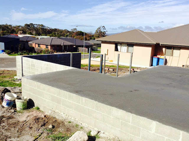
the slab has been poured! i'm so excited! i feel like the house is finally at the stage now where others can join in on the excitement as well. before, when it was just a few trenches dug into a plot of land, most people weren't doing the same nervous, happy jig i was when we showed them (totally understandable). but now, it's more real and much easier to visualize. here on in it really gets exciting (the frame will go up soon! eeek!) 

kitchen and dining

bedrooms, bathrooms and garage on the far side
kitchen, dining and living room

 this empty space (below) is the living room, which will be built on a timber frame instead of a concrete slab since it is pretty high of the ground. i think that's one of the things happening next. 


i've just realised that i always take pictures on the same side of the house, facing our next door neighbours. i should take more pictures on the opposite side because that faces out to our garden and a pretty clump of trees, which are so much nicer to look at. 

so there it is. the most beautiful chunk of concrete i've ever laid eyes on. hope you had a great weekend!

xx Bret 

Saturday, 14 September 2013

THE EXTERIOR


more progress! this has been so exciting. on thursday they had these big cement trucks pumping into the ground. it was pretty cool to watch. it's becoming easier to visualize the spaces and position of the house now. the living room is going to be amazing!

one of the things that ty and i debated over for a long time was the exterior. do we experiment with colour or do we keep it pretty neutral? our house is going to look something like this - 

- fairly simple and modern. the majority of the house is cladding. the panels surrounding the windows and on the garage are a type of material called james hardie easylap panel. it's pretty cost effective and easy to install so we went with it. our architect has designed it so the panels are the same height as the windows and will wrap around the entire house. like a belt. or a horizontal stripe. does that make sense?  the panel is designed to be painted, so we thought it might be fun to use a bright colour as a feature, with white cladding and a dark balustrade/fence.  so we experimented with heaps of different colour combinations. i sourced inspiration from fashion runways and magazines and any image that caught my fancy. 
we both really liked this yellow/gold colour and had pretty much settled on it, when ty drove past a house on one of the streets nearby and fell in love with its colour scheme and look. it was completely white. 
he now wanted a simple exterior and i was totally fine with that. so it was back to the drawing board, and these are the images that inspired me.

1 . 2 . 3 . 4

so finally, this. 


i love it and i'm kinda glad we're not doing a bright crazy colour because this will be beautiful and simple. if we can do it, the fence will be a really nice timber. i love how plants looks against a timber backdrop. and i love hydrangeas, so they are definitely making an appearance. 

have a good weekend!
xx Bret 

Thursday, 5 September 2013

FLOOR PLAN + OTHER THINGS


so, if you were to drive past our land, this is what you'd currently see. fun stuff! i'm amazed by how much has already happened in just a few days.  sorry about the grainy photos, i took these on the iphone at dusk, so they're not the clearest.

anyway, you can see from the photo below that we're building on a slight hill. our living areas are at the front of the house to take full advantage of the sun, so since the front part of the house will be elevated we still have a great amount of privacy which is super. just below that horizontal beam is where the living room floor will be. by the time you reach the back of the house, the rooms will be sitting on the ground again.


the land is a funny shape, narrow at the front and wide at the back, like a triangle. here's a sketch to give you an idea of where the house will sit.


the backyard is going to be so big and pretty in the summer. and the big deck at the front of the house will get sun all day long. we'll be spending more time outside then in i reckon!
our house is a nice comfy size. definitely all we need at the moment with just us and noo. here's a sketch of the floor plan...


the design is relatively open. i'm not a major fan of living/kitchen/dining all in the same room. i like this layout because while i can watch what nancy's doing while i'm cooking, they still feel like separate zones. as soon as you walk through the front door, you look straight into the dining room, so i really want that area to have a big impact. i've got lots of ideas that i'll talk about another day!
the wall of windows in the living room is going to capture the sun all day long. it will be heavenly! we're seriously considering building a window seat along that entire wall. against the opposite wall is our little study nook which i'm going to make so pretty :).
the bedrooms are cosy sizes. no major architectural features, but i've got plans to make them really fun and exciting nonetheless. also, i'm a big fan of having laundries in garages. it free's up valuable space and it's the second last room on my list of "spaces to make beautiful" (garage is last).

so there you have it! i'll post about the exterior tomorrow if i get round to it. we're leaving tonight for a weekend getaway to sydney to catch up with family (and maybe do some house shopping.)
have a great night!

xx Bret

Wednesday, 4 September 2013

BIG NEWS!


it's official. we're building a house and we are sooo excited! ty and i have been in the process of purchasing land for months, and on friday last week the last papers were signed and the land officially ours. even though those months of waiting might seem like a bother, it turned out to be perfect timing for when our builder was available. so with only a few days of owning the land the groundwork has already started!
it still doesn't quite seem real to me though, and it probably won't until we're moved in and unpacked. i'll be sharing heaps about this house building process (seriously. you have been warned) because designing my own home is a major dream come true. my head has been full of colours and door fittings for ages!  so if you're in to that sort of thing, i'm your girl.

more details about the house tomorrow!

xx Bret

Saturday, 6 July 2013

SNOW AND EMILY HENDERSON

we went to cradle mountain today. snow was everywhere! noo had so much fun, we all did. we don't get to experience much snow here in australia unless you go to the mountains in winter. it was the nicest way to spend the day with family, and even nicer knowing that we are blessed to have a safe and warm home to return to.


+

in my internet browsing tonight, i stumbled across another blog that i have fallen madly in love with. (my list of favourite blogs grows weekly). there's not much i enjoy more then a good before and after, combine this with emily henderson's amazing style and you have a blog made in heaven. i'll be back-reading her blog for the next couple of days i think.

xx Bret

Thursday, 4 July 2013

MUMFORD & SONS


i'm still working through more design projects than you can possibly imagine (slight exaggeration. the exact number is 6).

once again, music is helping me get stuff done and stay (a little) sane. this time, it's Mumford and Sons' recent performance at Glastonbury. they are really somethin' special.

i sense another one of my Mumford obsessions a brewing and i welcome it with open arms.

check out high quality videos of the show here.

Love, N

Monday, 10 June 2013

CHARTREUSE WALLS & ORIGAMI TILES

have you been watching the block? i have. it's one of the only tv shows i've ever really got hooked on, though i'll admit i am getting a bit tired of the "drama". but it's worth watching for all the good design ideas. for this last week's guest bedroom and ensuite, madi and jarrod used the most amazing chartreuse/yellow wall paint. i fell in love! i would never have considered that colour for walls, but i totally want to try it now! these pictures below in no way do the colour justice. the walls here look a bit custard-y. if you want to see the colour a little better, watch the room tour here.


and then trix and johnno used some beautiful white tiles in their ensuite. it looked like crinkled paper/origami. so so pretty!


so much inspiration!

xx Bret
Blogging tips